Figure 6 - The Surface Skin Effect
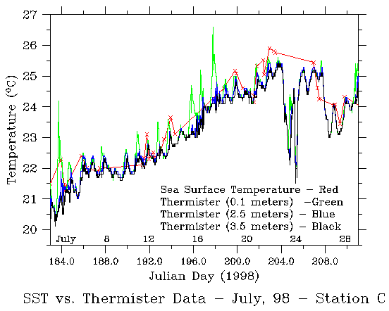
This figure is a plot of temperatures from three different sources, at
the exact same latitude and longitude. The red line is satellite temperature
while the green, blue and black lines are from thermisters (thermometers)
at depths of 0.1, 2.5 and 3.5 meters respectively. As you can see from the
green line, the afternoon sun does cause peaks in temperature on four of
the afternoons during the month (1, 16, 17, 18).
This summer we will acquire
this data in real time, so we will know if we can use an afternoon image, or
if it is "lying" to us about the surface temperatures and should not be used
for assimilation. If we were to use images from any of those four days,
the data assimilated into the model would be a few degrees warmer than what
is truly the temperature just a couple of feet down. This would be BAD!
If you're a scientist and would like to know more details on our cloud
removal, go to
(figure 7). Otherwise, lets skip the complicated stuff and go on to
figure 8.
.